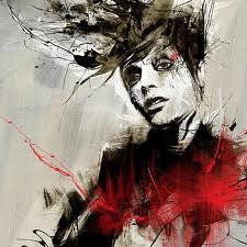
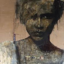
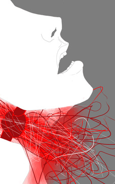
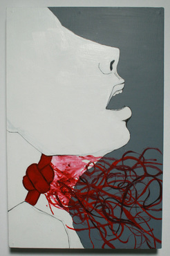
This semester I studied the works of artists Russ Mills and Guy Denning. My art teacher suggested that I study Russ Mills, because some of his illustrative qualities like selective detail and "lost and found realism" could be seen in my summer work. The expressive paint splatters and monochromatic color scheme have also shown up in various pieces of my work. Guy Denning I discovered myself while researching Russ Mills. I liked his use of multi-colored skin tones in his illustrations of people, and through that I could possibly some of those techniques in my pieces. Elements of both of these artists are apparent in several of my works; and in studying these two, I feel like I better understand my art and the process in which I make art.
As of now, most of my inspiration hails from the works of Russ Mills, a British painter and illustrator who graduated from Leeds Met University in 1995. One reason I enjoy his art is because it does not perfectly fit into one genre or category; Mills himself has even said that his work "dwells in a netherworld between fine urban art and contemporary graphics." His tight illustrations of people and faces also draw me to his work, and his expressive use of paint and Photoshop have given me a whole new perspective on the art I create- which often has to do with the themes of emotion and exposure. My first ten works were heavily inspired by Mills, using the same idea of tightly rendered areas interspersed between explosions of color and paint. Much of his work is focused on the human face, and often includes animal imagery. The “Nata5 Triptych” is a work that exhibits both his illustration and compositions skills, beautifully highlighting his ability to illustrate and combine animal imagery and human faces so seamlessly. One thing I have also found interesting about Mills is the fact that he works physically and digitally, often using both types of media in one piece. This has become something that I have started to experiment with, particularly with "Since Voce"- a piece that was originally digital but recreated using physical media. Much of his work is drawn using pen, and then the colors and expressive paint strokes and splatters seem to have been done digitally. I would really like to further explore this combination of digital and physical media, because I feel like if I can master this kind of process, it has the potential to yield outstanding results.
Guy Denning is also a British, urban, contemporary artist and painter. He was born in England and now lives and is based in France. He is a former member of Stuckism International and the founder of the Neomodern group. Guy Denning’s paintings are also feature people and faces, but are more painterly than the works of the illustrative Russ Mills. His paintings often contain multi-colored skin tones, something that I have also experimented with in my summer works as well as some digital pieces. His work manages to be abstract and realistic at the same time; the colors used in the skin tones and portraits do not reflect realism, but the way he uses shadow and various tones of these colors does. Much like my process when painting and creating art, Denning does not always have a clear concept or direction when starting a painting. In his artist statement he says, “Perhaps the accidents of pain give me a similar perspective as the view to the finished painting: the surprise at something fresh or something fresh or something that is not immediately understood in its construction.” I appreciate this process as I rarely make a work with a set meaning or intention in mind, as I have also said in my own artist statement. I feel as if this process is the best way to make art for me; the work is more sincere, the meaning is more genuine, and the message is often less literal when art is made spontaneously and without much premeditation. I love his work and his mindset regarding it; I feel as if they both reflect the kind of art that I hope to make one day.


 RSS Feed